Why mobile first is the way to go
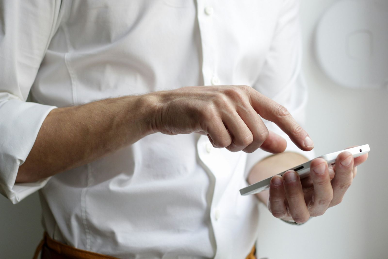
When someone hears about your business, the first thing many of them do is look you up on their phone. They might be on the sofa, on the bus or standing outside your shop wondering whether you're open. If your website is awkward to use at that moment, they don't pinch and zoom. They go back and try the next result.
That's the whole case for mobile first, and it's why every site I build starts on a phone screen.
What "mobile first" actually means
It means I design the small-screen version first, then scale it up for tablets and desktops. The opposite approach, designing a big desktop site and squashing it down afterwards, tends to leave you with tiny buttons, hidden menus and text you can't read without zooming.
Starting small forces the right questions. What does a visitor actually need? What's the one thing they should be able to do? Whatever survives that cut is what your site is really for.
Four reasons it matters for a local business
1. That's where your customers are. People searching for local services, opening hours or directions are very often doing it on a phone. If the phone experience is the poor relation, you're letting down the people most likely to get in touch.
2. Google looks at your mobile site first. Google uses the mobile version of a site when it decides how to rank it. A site that works well on a phone is helping your search visibility, not just your visitors.
3. It makes you say what matters. There's no room on a small screen for waffle. Clear headings, a short description of what you do, and an obvious button to call or book. That clarity helps desktop visitors too.
4. Faster pages for everyone. Designing for a phone means keeping things light: sensible images, no clutter, nothing that makes a slow connection crawl. A quick site feels better to use on every device.
What it looks like in practice
For a local business, a good mobile site usually means:
- Your phone number as a tap-to-call button, right at the top
- Opening hours and address easy to find, not buried in a footer
- A map link that opens straight in the visitor's maps app
- Buttons big enough for a thumb, with space around them
- Short sections and readable text without zooming
A quick test you can do right now
Open your website on your phone and give yourself five seconds. Can you find your opening hours and phone number? Can you tap a button without hitting the wrong thing? Does the page load quickly on mobile data rather than Wi-Fi?
If any of those make you wince, it's costing you customers, and it's fixable.
Where WordPress fits in
I build every site on WordPress with custom fields, so you can change your hours, prices and photos yourself without calling a developer. Mobile first and easy to edit go together: a site that's simple to use on a phone is usually simple to keep up to date too.
If you'd like me to take a look at your current site, or build you a new one, I'd be happy to help. Get in touch for a free, no-pressure quote.